Baby nursery inspiration, ideas and star buys
Every Friday (aka FRI-YAY!), starting from this week, Stella + the Stars will be all about little people and inspiration to decorate kids and babies' bedrooms.
It can be a daunting task to get a space ready to welcome a brand new human being and it's easy to get lost in a sea of plastic toys and 'practical' stuff that, let's face it, often looks dull, sometimes tacky. I believe little people should be surrounded by stylish stuff too and exposed to beautiful things early on to develop their taste for good design.
So here is my foolproof guide on how to set up a stylish nursery on a budget, showing you what I did for Stella's bedroom.
Room colour scheme
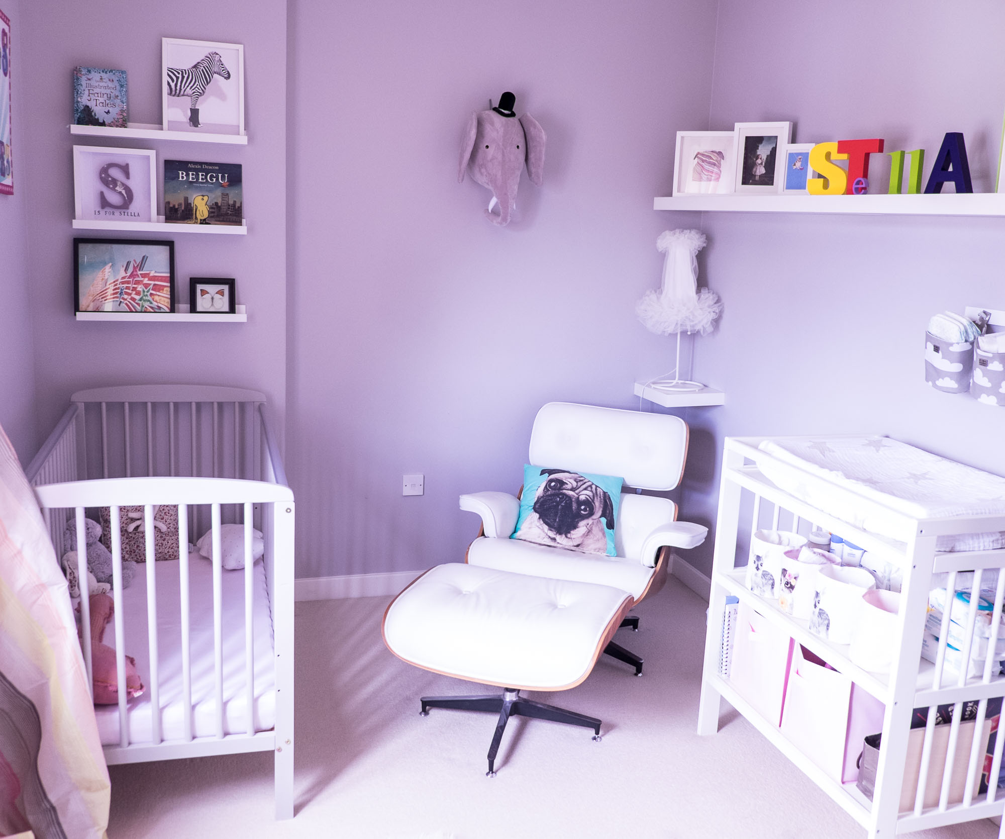
For Stella's nursery, I couldn't decide how I wanted the room to look like. I had trawled through SO many images on Pinterest, my pregnant head was spinning out of control. And I don't know if it was the hormones but I just couldn't make any decisions. I kept going back and forth from monochrome scandi style (I just thought it would give the room a serene and chilled vibe!) to bold and colourful (kids rooms should be fun, right?!). The fact that I was still trying to recover from losing my dressing room (RIP!) to turn into a baby nursery added to the piles of 'new baby' stuff that were starting to accumulate in the empty room - all that started to get me all anxious towards the end of my pregnancy. Budget was also a big factor in every decision so I had to work hard to find stuff that weren't costing the earth. In the end, I went for a neutral scheme of light greys and whites (I know! I can't believe it myself either! I tell you, those hormones...), with a few accents of pop colour (phew...) - something I thought I wouldn't get bored of easily and hopefully would be fairly timeless as Stella grew. 18 months on, it worked out a treat and it's now one of my favourite rooms in the house.
Walls
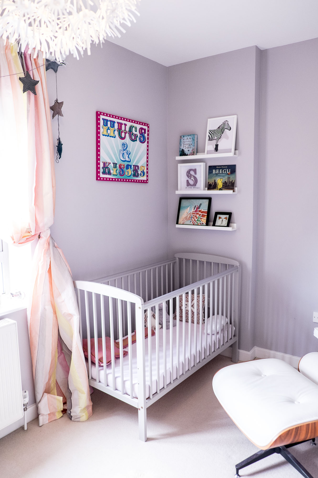
As with our living room revamp, the first thing we did was repaint the walls, in light grey this time, to create a cosy backdrop to all the accessories. We used , which is a lovely light grey with a hint of lavender. I didn't expect to like the result at all when the painter started but I was pleasantly surprised once the whole room was done.
Baby cot
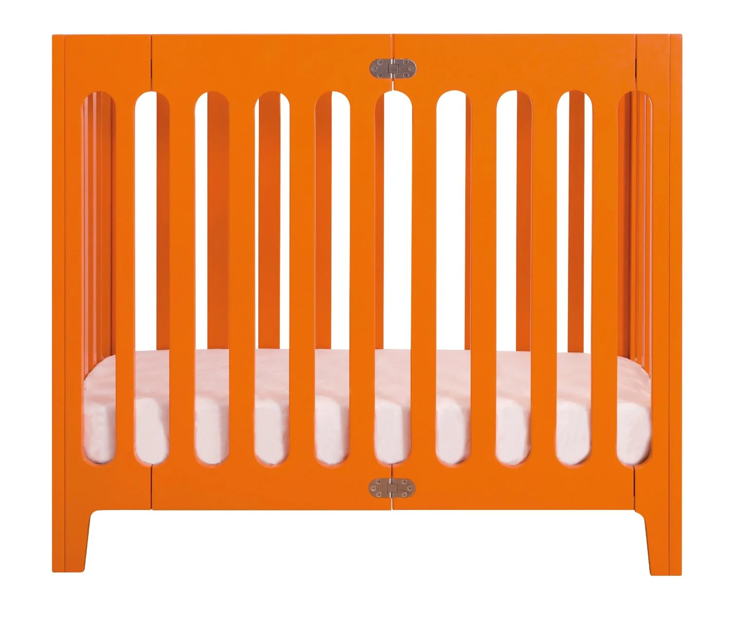
Originally we had a beautiful Bloom Alma crib in bright orange that I bought second hand on ebay and that I adored but Stella grew out of it after a few months (it's foldable so will be used for baby number two one day, hopefully!)
The stunning and colourful Bloom Alma crib Stella spent the first few months of her life in...
The bigger cot version from Bloom was way out of my price range so I needed a cheaper alternative.
After weeks of research I found the perfect compromise from a shop I had actually never visited - Toys R Us! (yes that's what happened when you have kids?!) The new bargain grey cot has been a total winner and matches the wall...
Changing table
There are so many uber stylish alternatives to the classic changing table available now, I really wanted to go for something different. I loved the idea of a chest of drawers with a mat on it, but for the first time in my life I had to put practicality before aesthetics (shivers...) as I have a bad back and really needed the table to be fairly high. Again my mind went into overdrive and I just ended up buying a standard white changing table from IKEA. Looking back it's been a great buy. To dress it up, I bought a bunch of storage boxes and baskets from H&M home. They have a fantastic collection each season and all their accessories are cheap as chips.
Nursing chair
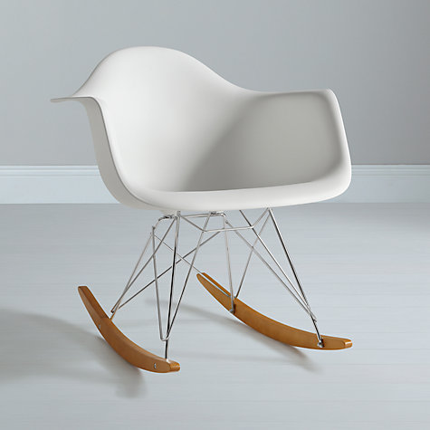
I went on a mission to find a beautiful but comfy armchair, under £500... Now that was a challenge and a half. I already had a replica Eames chair and ottoman (hubby was aiming for husband of the year award that year for my birthday...) and decided to use that instead of a boring nursing chair. It's so comfortable and easy to wipe clean. When I was feeling low during that 3am feed, let me tell you it was cheering me up BIG TIME... Another cool option is the Eames RAR rocker. Voga have fantastic replicas for a fraction of the price of the original.
The stylish alternative to the traditional nursing chair, courtesy of Eames...
Lighting
I recommend three separate light points for a nursery: one bright ceiling light to be able to see what the hell you're doing when changing that tiny bum, one table lamp with lower wattage if you have to change a smelly nappy in the middle of the night, and one night light for feeding in the darkness...
I went the IKEA route - remember, BUDGET?
The dandelion ceiling light and the tutu table lamp, both from Ikea, added texture to the room decor...
Baby book library
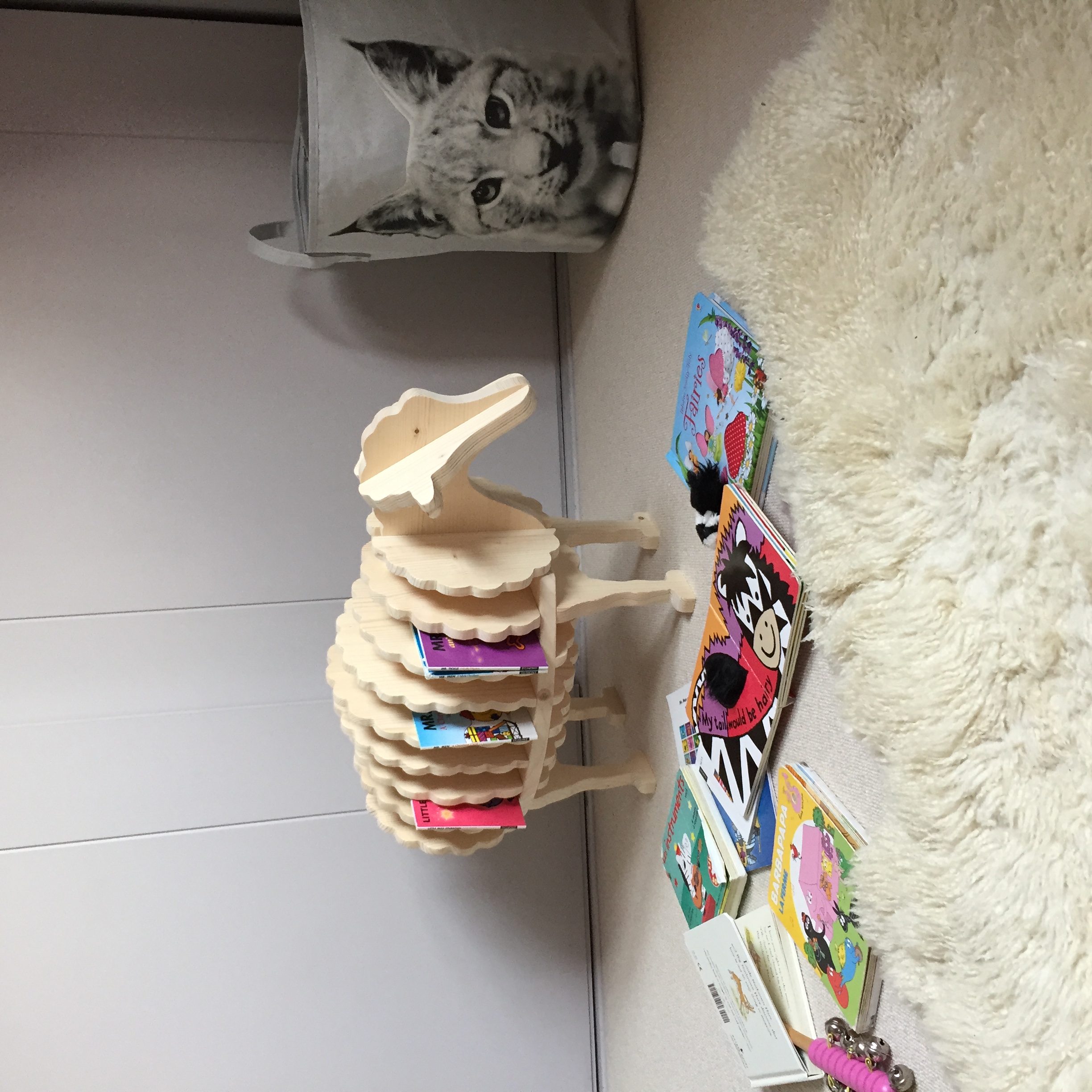
I love the display of some of her books and my favourite prints on the white wall ledges (from IKEA again!) but after just a few months her collection of books started to grow at light speed and we ended up with piles of books in a corner of her room every night. For her first birthday she received this beautiful baby book shelf from Rowen and Wren, called Baa Baa. Stella loves it and it looks very cute in her room. She can also put her books back on the shelf all by herself at the end of the day.
The Baa Baa bookshelf in action in Stella's nursery
Accessories
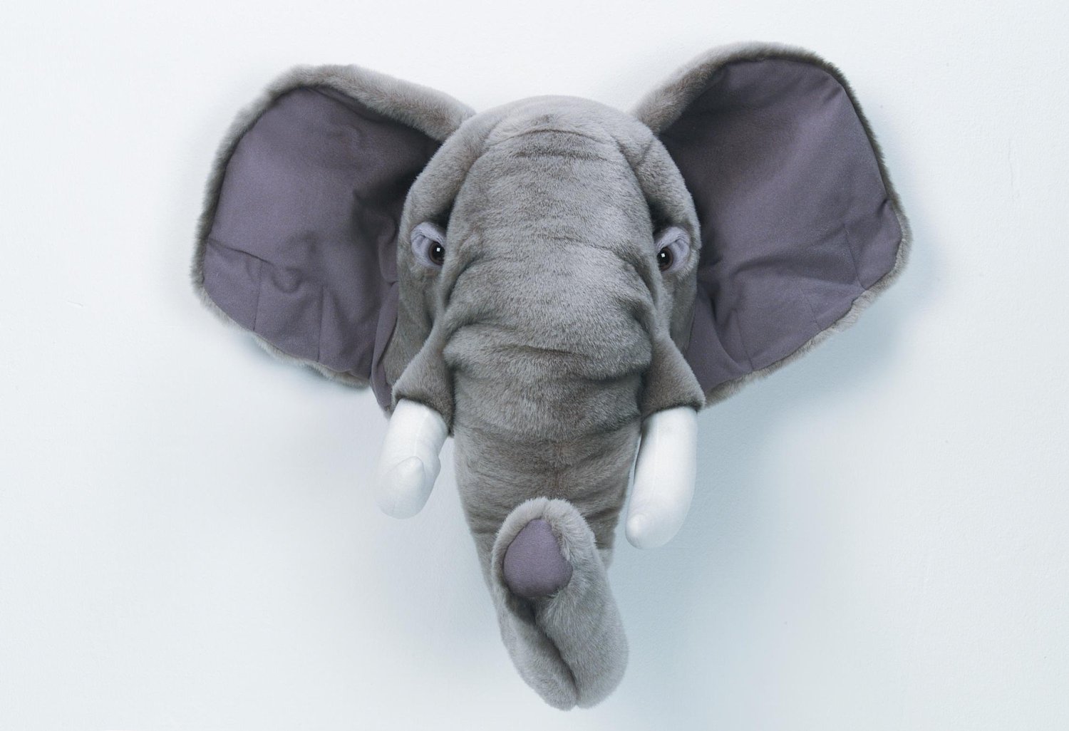
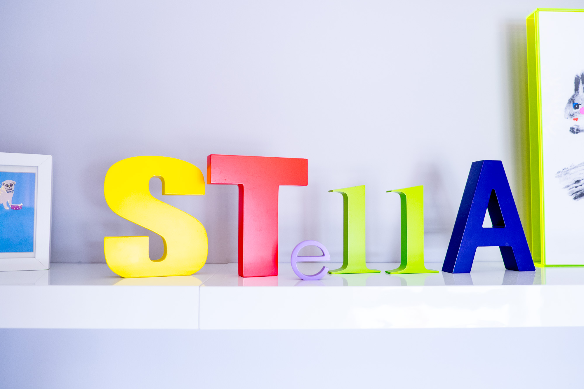
Once you have all your big items, it's time to go wild and let your imagination take over. The more quirky and fun the better! Animals, funky prints, soft toys, shelves, there are no rules, just make it fun. I started collecting cute prints before Stella was born, and then just bought frames and a big floating shelf from Ikea to display them. I keep changing them as I find new ones. The large pink frame 'Hugs and Kisses' was an unexpected bargain find from TK Maxx, and the letters that form STELLA on the shelf are from This Modern Life. The soft toy elephant head was from H&M home and you can find an alternative below.
Wall Decoration Soft Toy Elephant's Head from Bibib.
The coloured letters to spell Stella in her nursery are from This Modern Life.
Have fun decorating!

